A gut-health centred nutrition brand built for clarity, science & lifestyle wellness.
Strategy, Logo Design, Typography, Packaging & Brand Guideline System
View Behance Case
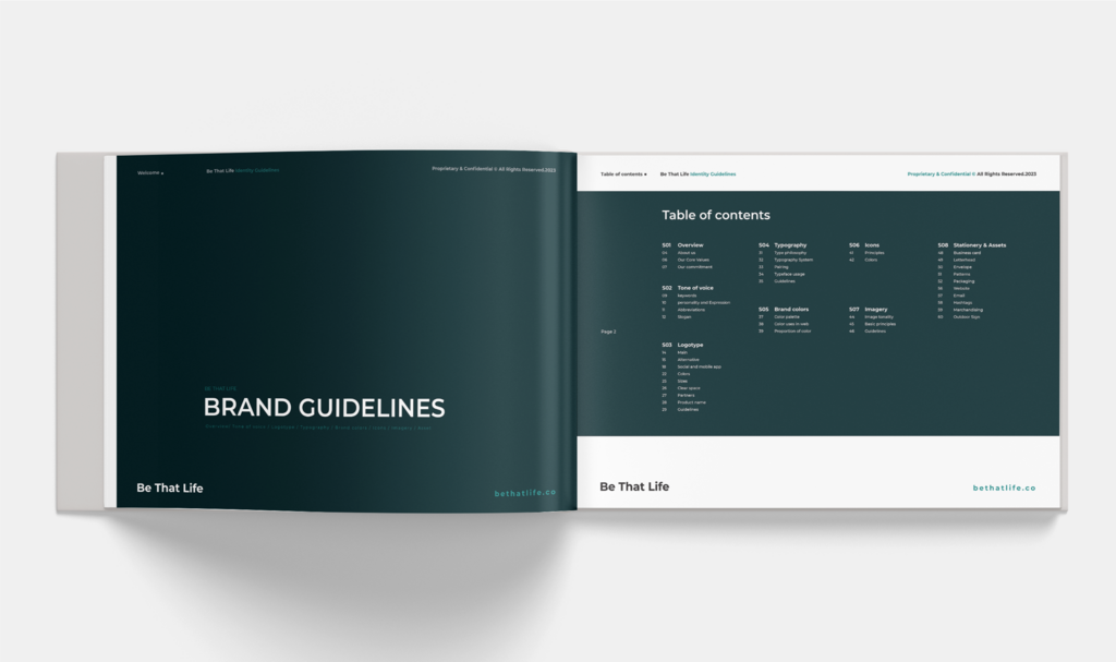
We approached the brand with a balance of scientific structure and emotional clarity. The visual and verbal identity needed to feel trustworthy like a medical brand, while still being warm, human and lifestyle approachable.
Our key focus: gut-health symbolism, simplicity, readability, shelf presence and identity scalability.
✔ Research & Strategy
✔ Identity Foundation
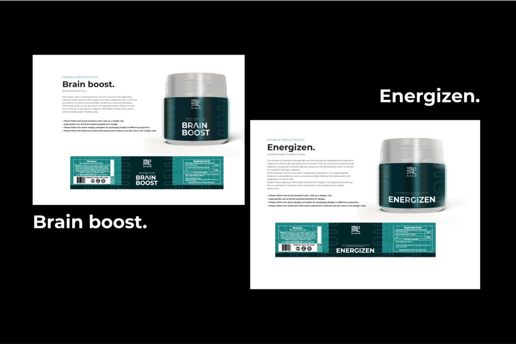
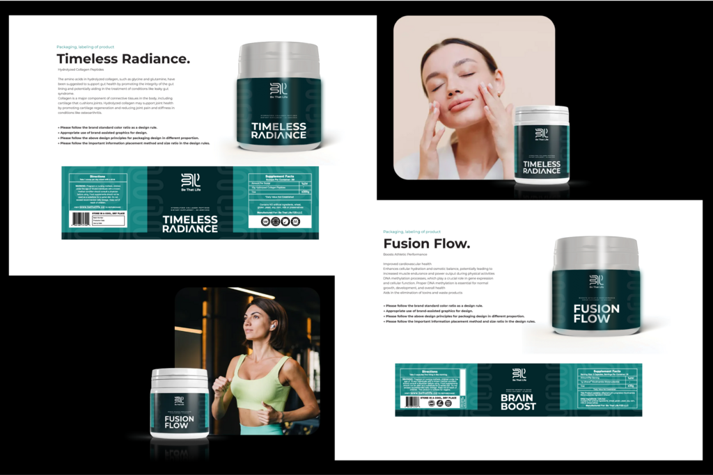
✔ Packaging System
✔ Digital Communication & Animation
"Integrative Health"
• Clear, calm and confident
• Human health-focused, not sales-heavy
• Science-backed statements without complexity
• Encouraging tone — soft, positive, practical
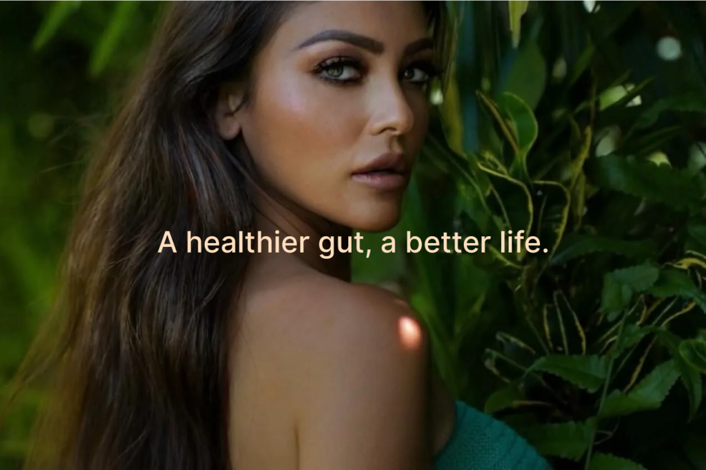
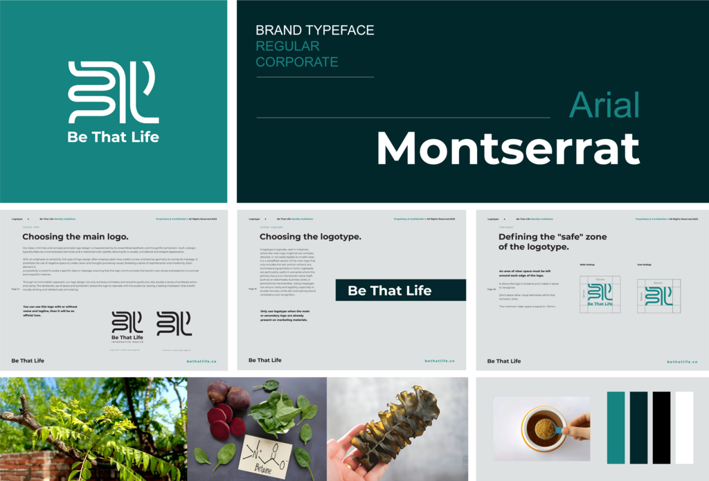
The identity blends minimal geometry and calm colors, creating a consistent premium feel across packaging, digital interfaces and guideline applications.
Pure ↦ Teal & White Space
Clean ↦ Structured Layout Grids
Modern ↦ Sans-serif Typography
Premium ↦ Minimal Label Treatment
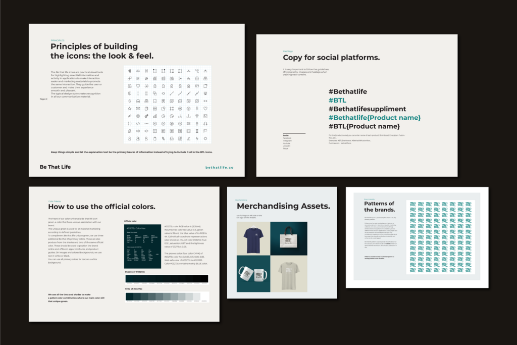
A modular packaging system with high readability, contrast and shelf recognition.
Certified clinical nutritionist &
Founder,
Be That Life